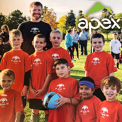
Apex Park and Recreation District in Arvada, Colorado, is a special district that serves approximately 120,000 people and operates 12 facilities, nine sports complexes, five pools and one golf course. In 2016, we embarked on a journey to create an improved, easy-to-use registration system for both the staff and the community. As we began the request for proposal (RFP) process for the new system, district leadership determined it was also the right time to refresh our old logo, and a seemingly innocent decision to upgrade our registration system caused an exhaustive, but exciting, examination and redesign of our branding and communication standards. We were launching an important new amenity to the public and we wanted to do it in style!
One of the first steps in this process was securing the funds to hire a design consultant. We spoke to our board of directors, who were excited about the changes and, with their help, were able to allocate money in the budget.
We started the RFP process for the new logo, just as we had done for the registration system and, ultimately, hired a local design firm to take on our logo refresh.
Before we could determine the “look” of our new logo, we needed to engage the staff and the public in helping to define what Apex is and what we do. Those conversations revealed a few elements that were essential to us in the new design: our name and the mountain icon. We wanted to keep our name but not in all caps, as there had been confusion about whether “Apex” was a name or an acronym. Our name comes from a local mine within the mountains above our location, so it was also important to keep some symbolism of the mountains to pay homage to our history. We wanted to stay true to our character but hoped that with a renewed look and clear messaging the mountain logo could become an icon to the community.
The listening process helped not only to identify important elements for the new logo, but also to create a completely new brand messaging document that included our mission, vision and positioning statements. Finding our identity also had an impact larger than just the brand refresh. It unified staff and sent a clear message to the community about what Apex is and all we have to offer.
Eventually, the registration system and logo redesign would be loaded onto our outdated website, which also did not match our printed materials, such as our activity guides. With the other changes already in motion, it was the ideal time to reorganize many of our assets to embrace consistency across the district. This led to yet another RFP process to find a firm to help redesign our website. It also meant creating a new activity guide to match the structure of the website.
Operation ‘Go Fourth’
A new registration system led to a logo redesign and a brand, website and activity guide refresh. As we were planning all these pieces and how they fit together, we realized we needed to create a public relations campaign to communicate these changes to our staff and community, and launch them all at once in a cohesive, organized manner. As a result, operation “Go Fourth” was born.
In the month leading up to the launch, which was scheduled for December 4, 2017, we teased the changes through social media, our website and with an advertisement in the local paper. We created some excitement around it by telling community members, “Changes are coming…big things are happening at Apex,” and emphasizing the enhanced customer experience with the new registration system and activity guide. Ultimately, we were able to educate the community about the importance of what we were doing and why in a way that made them eager to see what the new Apex would bring.
December 4 was a very exciting day, and the launch went according to plan. Our staff was prepared, the community was excited and months of work was finally made public.
Apex has seen exceptional growth since the launch’ of its refreshed brand. With the updates to the registration system, we are now working with better data. Internally, it is much easier for staff to use, so they are better able to assist community members. Externally, people are more likely to use the system as it is more intuitive. Each of these elements makes Apex Park and Recreation District better suited to help the community we are here to serve.
Thanks to the visioning exercises, staff now have a collective identity, as well as a renewed passion in our mission. Overall, the increase in awareness of Apex in the community has been immeasurable. With a modern look and information that is easily accessible, people are now excited to be part of our brand and to use our resources. As we hoped, the new logo has become a symbol for all the other positive changes taking place within the district.
In the end, the refresh process was an incredibly positive experience. It has given our work a breath of fresh air and positioned us to move on to the next phase of our work in an energetic, confident direction. We are proud of where we came from, but are so very excited to see where we are going.
Katie Groke Ellis, MPA, CPRP, (@grokey), is the Marketing, Community Outreach and Communications Director for the Apex Park and Recreation District (@apexprd).

