


To those of us in marketing or communications, a rebranding process is an exciting time. It’s a time to assess if our organization’s branding accurately reflects our membership, our mission and the diverse communities we serve. It’s a time to use our skills to create something park and recreation professionals will be proud to support, promote and wear on a t-shirt or hat — because, let's be honest, we know park and recreation professionals love their swag. And, it’s a time to consider what imagery will resonate most and create a lasting memory in the minds of decision-makers with whom we share NRPA’s priorities.
If you’re noticing a theme here, you’re probably right.
We are proud to share the results of NRPA’s latest rebranding process and share our fresh, new logo with you today! But, before we get into all the fun details, we would like to give you a quick overview of the evolution of the NRPA logo.
NRPA was formed on August 14, 1965, when five organizations that were each involved in the support of park and recreation services in the public sector — the National Recreation Association (NRA), American Institute of Park Executives (AIPE), American Recreation Society (ARS), the National Conference on State Parks (NCSP), and the American Association of Zoological Parks and Aquariums (an affiliate of AIPE) — merged to form a single entity.

Pictured above: NRPA logo from August 14, 1965 to early 1970s.
From 1965 through the early ’70s, NRPA’s brand was represented by this simple, yet timeless logo. The map in the center is broken up to show NRPA’s eight regional branches at the time.
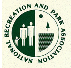
Pictured above: NRPA logo from the mid-1970s to early 1990s.
In the mid-1970s, NRPA made a radical logo change to the much more complex and representational version you see here. It appears that NRPA really latched on to this logo as the organization continued to use it into the mid-1990s, making it the longest-tenured logo.
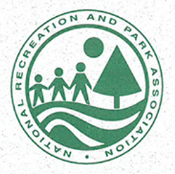
Pictured above: NRPA logo variations from the mid-1990s to early 2000s.
The logo was then redesigned to the version above which pulls many elements from the previous iteration. Based on our research, this logo seemed to be used in various color combinations over time.
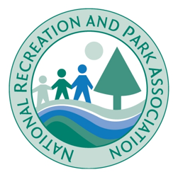
Pictured above: NRPA logo from early 2000s to July 2016.
In the early 2000s, NRPA redesigned and simplified the logo once again. NRPA continued with this logo until July 2016.
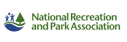
Pictured above: NRPA logo from July 2016 to today, September 21, 2021.
NRPA’s most recent logo actually debuted as the 2015 NRPA Annual Conference logo. There was such a strong response to the logo that we decided to adapt the design as our full-time brand in 2016, as well as incorporate NRPA’s tagline, “Because everyone deserves a great park,” in 2017.
This leads us to today’s new logo:
![]()
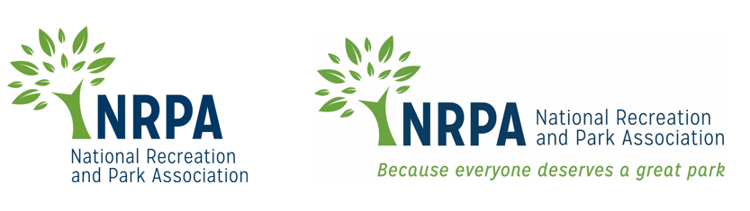
Pictured above: NRPA's new logo, as of September 21, 2021.
The overall design, fonts and colors were all chosen to give the logo a fresh, clean feel. We believe this new look and vibrant color palette truly reflect the diversity and joy within the field of parks and recreation — and the appearance of the leaves almost “embracing” the NRPA letters could be interpreted as the connection that park and recreation professionals have with nature.
Over the past few years, we have made an effort to bring consistency across our entire brand. You will notice that the branding for most of NRPA’s programs and publications has a consistent look and feel, and we’re looking forward to continuing that consistency with this refreshed logo.
We are so excited about our fresh new logo, but to be honest, NRPA shouldn’t even be known for its logo. We want to be known for our membership of more than 60,000 park and recreation professionals who work hard to better their communities every day. We want to be known for our efforts to make green space and healthy activities equitable and accessible to all people. We want to be known for our work to support the argument that parks and recreation is an essential service in communities everywhere.
No logo will ever be able to represent all of that, but our actions can and will. NRPA’s members are the catalysts for positive change in their respective communities in service of equity, climate-readiness, and overall health and well-being, and we hope you’ll be proud to have this new NRPA logo represent the essential work you do every single day.
Catrina Belt (she/her) is NRPA’s senior manager of marketing.
Cort Jones (he/him) is NRPA’s manager of strategic communications.